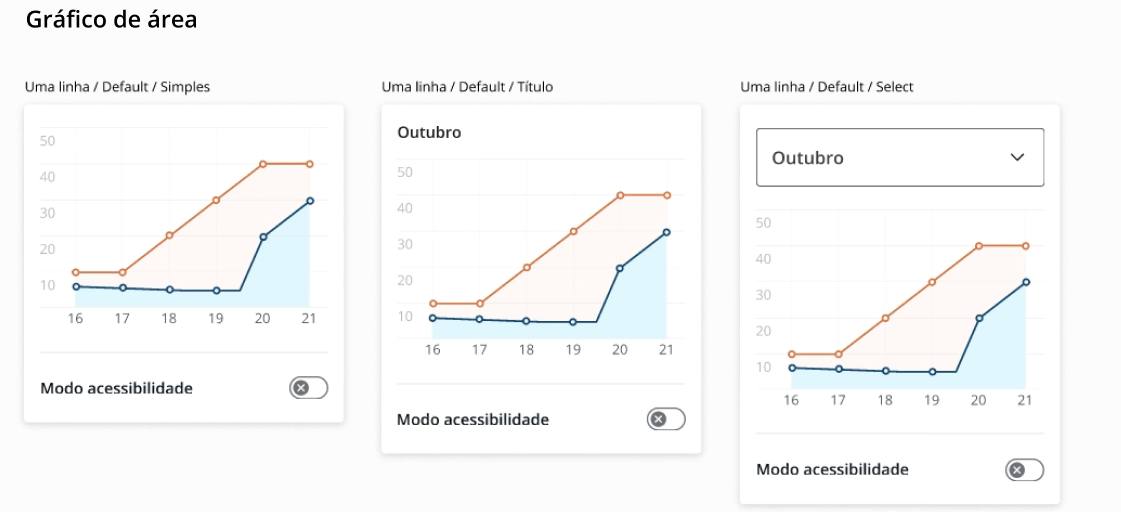
Along with the task of redesigning the app homepage in parallel with the construction of the Design System, came the necessity to redesign the current graph component and creating new types. The goal was to bring a better form of visualizing the informations that would be easily understandable and acessed by anyone. The project has not been finalized yet.
Identified Problems:
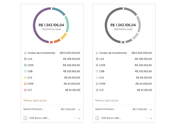
Lorem ipsum dolor sit amet, consectetur adipiscing elit. Fusce volutpat, tellus et rhoncus lobortis, enim arcu mattis sapien, eu bibendum nisi massa sed augue. Sed porta eu urna eleifend vulputate. Donec in tincidunt libero, et varius nibh. Vestibulum ac lacus nisl. Nullam blandit pellentesque porta. In dolor neque, tempus in commodo lobortis, volutpat in sapien. In at metus et erat porta ornare. Nulla fermentum nunc tempus lectus ullamcorper sollicitudin. Sed tempor est sit amet eros sollicitudin, eget semper lacus vulputate. Donec interdum enim a nisl imperdiet aliquet. Donec at augue ex. Cras nunc metus, lacinia ac tellus ac, consectetur lacinia neque. Mauris laoreet aliquet dui quis egestas. Pellentesque sit amet neque sit amet ligula efficitur malesuada.
Nam ut maximus quam. Aliquam dapibus posuere erat ac sagittis. Praesent rutrum dolor id lacus efficitur dictum. Fusce non diam vulputate, lacinia erat fermentum, efficitur risus. Nullam sed metus lobortis, commodo ligula vel, porttitor ex. Curabitur pellentesque ut urna vitae rutrum. Donec maximus hendrerit dolor, auctor placerat nisi varius a. Lorem ipsum dolor sit amet, consectetur adipiscing elit. Nulla sollicitudin sapien a metus tristique volutpat. Cras rhoncus, purus sed accumsan pretium, nunc tortor venenatis est, non dignissim erat libero non leo.
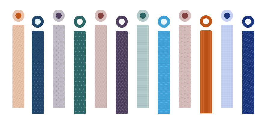
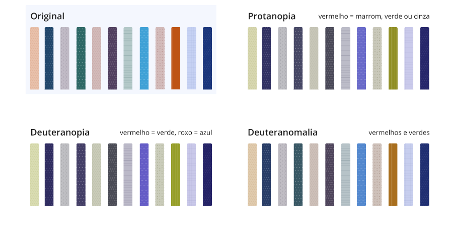
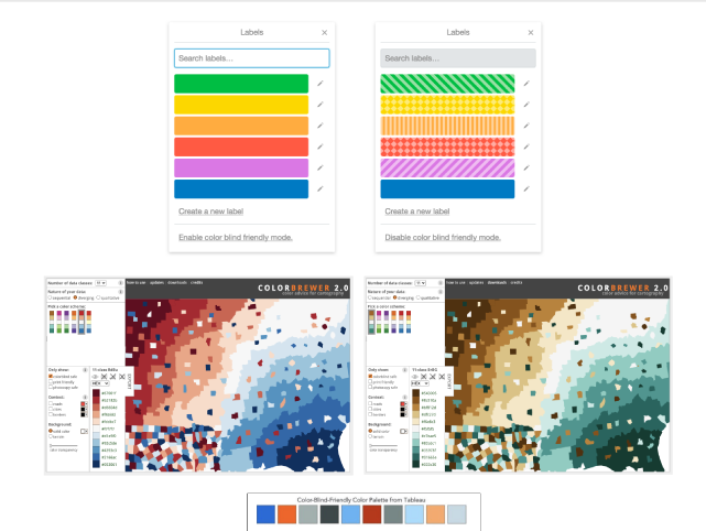
It was decided to proceed with a bar graph in order to provide better understandment of the content. With that it was iniciated a color and pattern study based on the current color tokens with the best accessibility possible.
There are currently 12 investments (the topic of the graphs), so there were chosen 12 colors. The colors were alternated between lights and darks for better contrast and similar ones were separated. The same color tokens were used as a lightest + darkest / darkest + lightest combination for the pattern to have a good contrast without giving too much visual information.
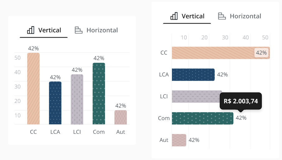
After those studies, the design of the graphs itself began. Those are the latest results of this project
